Hi there
As part of a reorganization of our town hall, we’re looking to unify the font used. The town hall was built 1958-60. It is not known precisely when the lettering is from but it must be around that time or very shortly after.
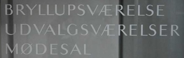
The original font is an Optima-looking one, Optima coming out in 1958 would fit chronologically, however there are some dissimilarites. I’m not a font expert, so I do not know the correct terms, but some notable differences are:
- lines in S taper out, do not thicken
- left downward line in Æ does not thicken
- lines generally do not thicken, e.g. the horizontal lines of E
- M has vertical lines, in Optima they’re slanted
- the arms of V and Y are much wider
- the A also seems wider
- the slanted downward line i R is much longer
- the middle vertical line in E is not centered, seems slightly above center
I have researched the various files about building the town hall, however the signs are not mentioned. I doubt the font was created specifically for the Town Hall, as this would most likely have been mentioned in the files.
So I was hoping some font experts might be able to name the font. let me know if you have any ideas.
Thanks for reading!