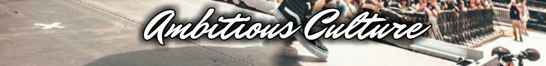
That looks like Mr Dafoe Pro:
https://www.myfonts.com/fonts/sudtipos/mr-dafoe/

Dear Brent,
Thanks for taking the time to look it up. 
It is not quite the same font. “r” and “C” aren’t the same. That’s just some of the details that makes them different.
Anyone else? 
Brent is right. I can’t see a significant difference. The slight variations in the C and r most likely were caused by the stroke and drop shadow effects and blending the type with the photo behind it.