I am trying to reproduce the font on this dedication sign so that I can fill in additional currently-empty spaces.
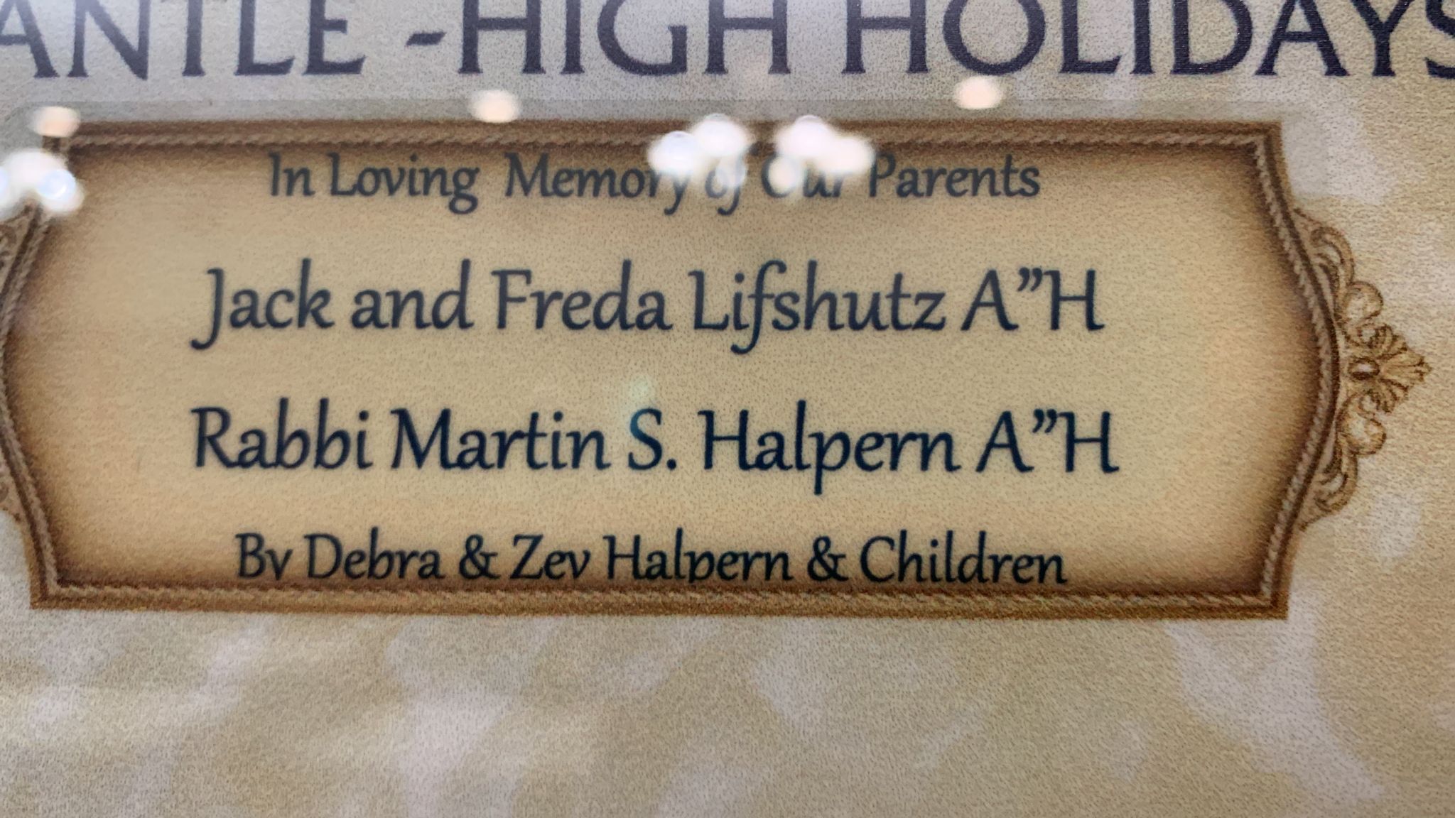
The letters k, n, d, e, f, b look similar to various Garamond italic variants, but the uppercase letters are totally wrong, as are the a, i, p and others, and the print in this image does not look slanted enough to be italic.
The uppercase letters look a lot like Carbonium, but the lowercase letters are all wrong.
The " and & are wrong in both of those fonts as well.
Matcherator gives me around 40 suggestions, all of which are completely wrong. (I also tried WhatTheFont, and it gives around 50 suggestions which are all wrong as well.)
Can anyone identify this font?