Hello.
Can someone help me idetify this font?
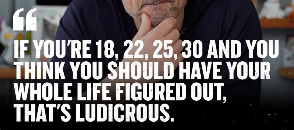
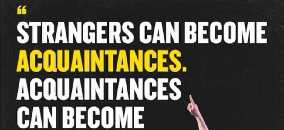
Lots of content creators are using it in uppercase as titles on Instagram posts.
I like it because of:
- E: middle stroke/cap is shorter
- S: elegant, slim, curved stroke
- G: extra stroke/leg on right bottom
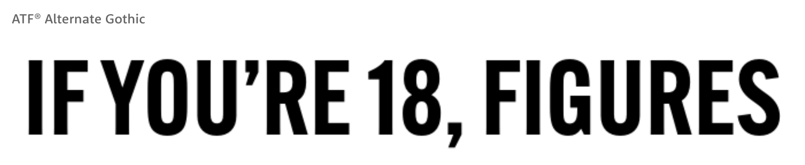
Bebas Neue
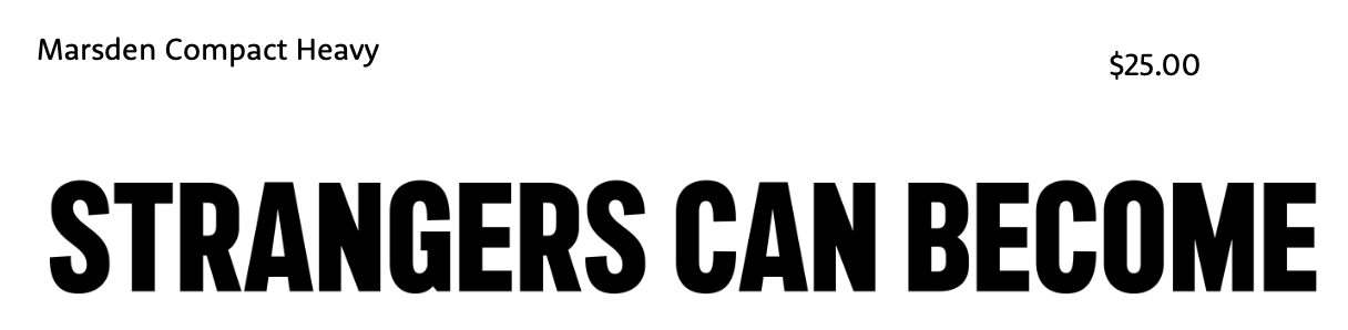
Veneer
are not quite the ones I’m looking for.
Anybody recognizing this.
Thanks in advance ![]()
Cheers, Mika