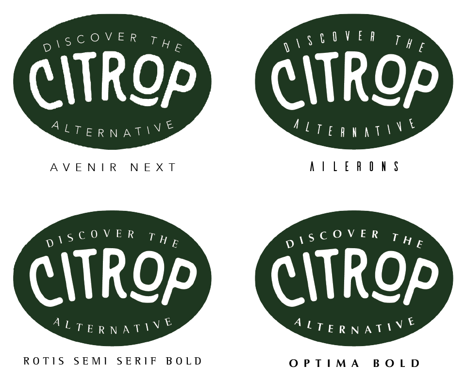
Hi, I’m having some trouble choosing a font to pair with my logo. The font for the logo is called Nature Spirit, that I have altered to fit with the project (The brand is an eco friendly brand that will have products that are an alternative to common plastic items). But I’m having a lot of trouble finding the right pair for this font.
I’m attaching a photo so you can see the logo with the font I’m considering (Poppins)

!
Pair in what way? Do you mean for “Discover the Alternative”? That’s an unobtrusive Futura-like face, so it doesn’t compete with Citrop. I would consider making it one weight lighter (but not very thin). Or do you mean as a general-use font for text or as a second font to use for the address, etc.?
Hi,
Sorry if I wasn’t clear with my question. I couldn’t upload more pictures to show different typefaces so it lacks context a little.
Yes, I meant does “Discover the alternative” font (Poppins) go with the main text “Citrop” ?
Thank you
It’s okay to me: It a plain face that doesn’t compete with Citrop. That’s good. The back-up singers shouldn’t take attention from the lead singer. It’s a stylish and attractive face, so it looks good in the supporting role. And it’s easily readable.
In school it was expected that you would use a serif with a sans serif; however, in this case I don’t think it would look great. . . Have you tried using a lower case letters?