Hello, does anyone know what font their logo is?
My guess? Commissioned from scratch. It looks like a lot of slab-serif fonts, but there are distinct differences:
bowl of g is a circle and the tail is also circular, ending in a cleanly cut terminal
the open terminals of the r, a, and s end with an abrupt square serif that does not cross the stroke
the bowl of the a is flat on top
1 Like
awesome feedback thank you
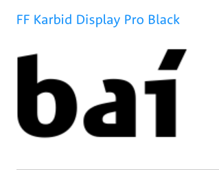
Typehuile (or anyone),
Do you have any idea’s on the Bai logo beverage font? https://www.drinkbai.com
FF Karbid Display is not it, but it’s very close and might be a starting point for a custom logo.
Any ideas on the ‘Bubbles’ font, which, is obviously custom but any good directions?
This is mine… https://www.idealoats.com/
I often do it this way:
- Search for a match on What the Font or WhatFontIs.
- If there is not exact match, I select a very close font, then I use “similar” feature in Indentifont to search for fonts that resemble the font I found on the other matching sites. That gives me a list to look through.
- If I can’t find it in the first Intellifont list, I use the “Search for fonts similar to X” (on the right) and generate a new list.
Using this method, I found Hastadaya, a font that resembles the Bubbles font, and searched for a similar font with Intellfont.
Totally. I am obsessed with Whatthefont but you are better at it. THANKS!!!