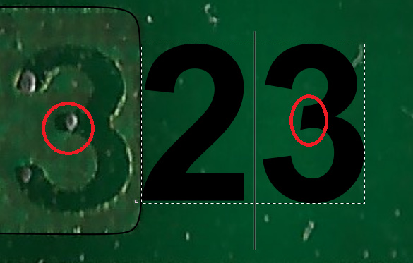
I’d start with Helvetica and then expand outward to the closely related faces like Nimbus and CG Triumvirate, explicitly designed as Helvetica look-alikes. I’d also look at faces that Helvetica came from, such as Akzidenz Grotesk by Berthold. The AG family of faces is wide and not perfectly coordinated, but I found a few samples with a figure 2 in which the slanted stem has a curved “bump” before it meets the lower horizontal leg, and a 3 that resembles the Commodore circuit example. Don’t forget that the method of printing on circuitboards probably distorted the letters a bit, like the thicker stroke of the two curved humps in the 3 above.
yes, the boldness or how thick things are i would ignore first time arround
and the quality level of the time would also have a say
but i will start with helvetica first and see how close a match it is, does the year 1981-1982 have much say in it? what i find dificult is ruling out fonts based on what would have been availble
EDIT: what i mean with the above is, example, nimbus is said to be released in 1987 and since the board was put in production in late 1981 to start of 1982 it cant be nimbus
Given that i’m after fonts that where out in 1982 are there so many options?
i would have looked at more fonts but the term "AG family " does not tell me as a noob in fonts much, but had i know i would have tried it out
but at any rate i think this is pretty close, but not sure if it can get closer if restriction is that the font must be time era correct
EDIT: my reasoning behind limiting things to what was out in 1982 is that since the production methods at the time was so “flawed” it introduced at lot of errors that could make it look like an entire new font, and hence going for the best match of what was out in 1982 would give the correct one without the flaws
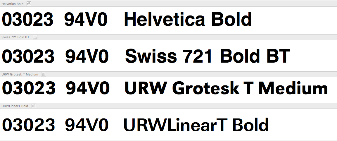
Helvetica was released in 1956 by Haas and more widely in 1960 for machine setting by Stempel. So it was the newish kid on the block in the early 80s. Again, the printing method for the circuitboard probably distorted the letters a bit. Here are four fonts that might be the source.
Helvetica Bold got so close that if i take in to account the less than perfect production methods of PCB’s back in the day and limiting to fonts that was availble at the time then it rules out the others