Other than Kabel, which I have, could anybody suggest another font or so whose uppercase “E” has a shorter middle stem?
Hey @WalterO, I have chosen a few fonts from FontSquirrel that you might like:
-
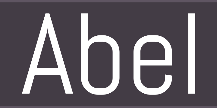
Abel is a modern interpretation of the condensed flat-sided sans serif. Originally used for newspaper headlines and posters, this style can also be used for text on the web. Its angled terminals and spiked stems give it enough style to be unique at display sizes, while its mono-weight still works well at smaller text sizes.
-
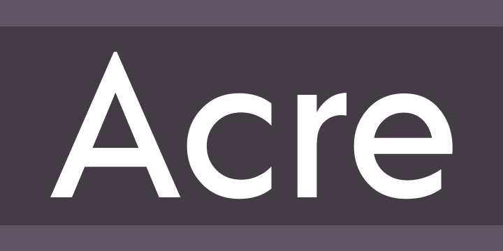
Acre is a geometric sans-serif family of eight weights that’s both inspired by and named after my great grandfather, Tex Acre. Tex was an artist and sign maker whose handcrafted signs illuminated the roadsides of the American Midwest and typified mid-century Americana. Acre is a tribute to him, his work, and many of my favorite early 20th century geometric typefaces. With eight weights ranging from Thin to Black, Acre is an extremely versatile family that can be used for display, text, or anything in between. It has full European language support plus many OpenType features such as tabular and oldstyle figures.
-
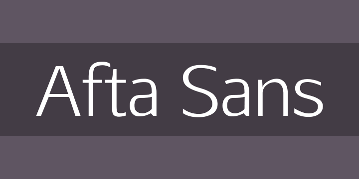
Advent Pro is a modern font designed for web and print. Advent Pro utilizes some of the universal characteristics of the sans-serif genre with modern characteristics to give an edge to your typography.

If you would prefer a different set of fonts with possibly certain characteristics, please make sure to reply and say so.
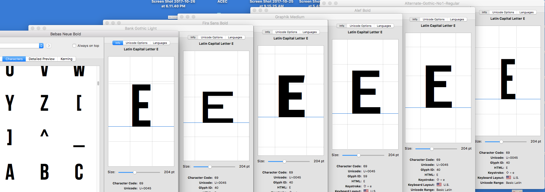
Many, many sans serif faces (and serif faces, too) have short middle arms on the cap E, but often the middle arm is almost as long as the top and bottom arms. Here is a screen snap of the cap E six five faces (using Font Explorer). What other design qualities of the font are you interested in?
You’ve posted some excellent examples which have given me much to think about and work on. Thank you.
At this point, just the short middle arm “E” to reproduce a sign that was on some electronic equipment from 1930-40. For that purpose, even Arial would work for most of the uppercase letters but for the “E” and “F” Good examples and lots to think about.
Thank you.