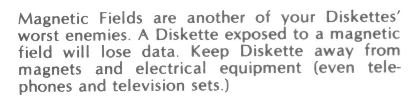
To me it looks like optima, however some letters are different, perhaps someone can figure this out, thanks.
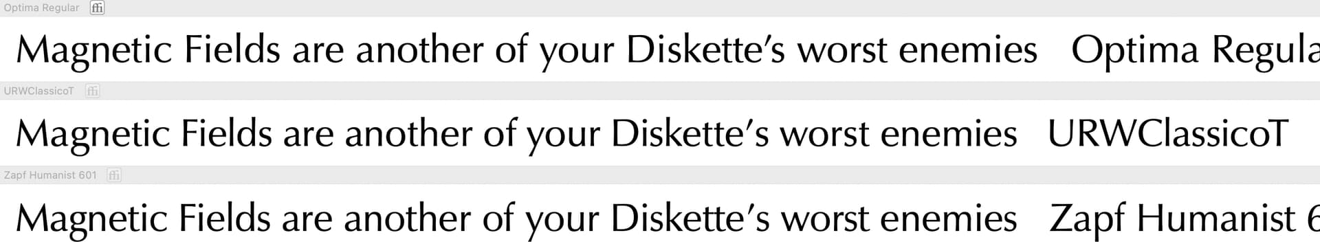
Looks like Optima to me. The only small difference is the lower loop of the g is smaller in this sample than in Optima. Here are three variants of Optima:
Thanks for the response, I had the same thought about the small g, my thinking was is there some odd variant to this font out there or just a printing glitch.