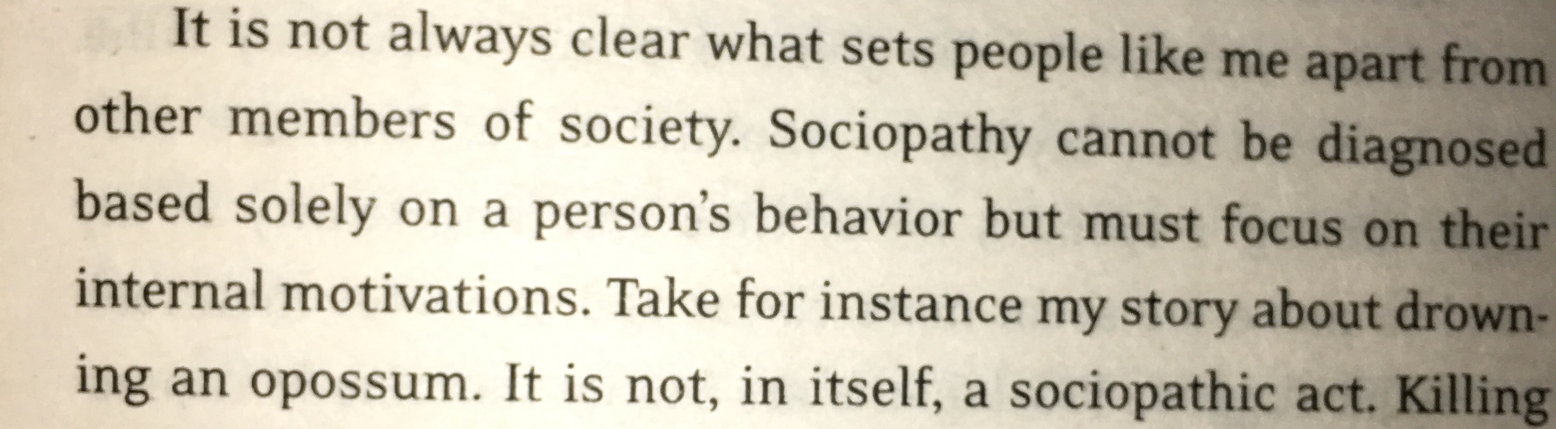
Can anybody help me identify this font, it’s from a book.
Thanks in advance 
The font is Matt Antique. Click here to buy it.
QoF: Matt Antique reminds me a lot of Apollo with a bit of Mirarae thrown in.
Yes, I agree, @Typehuile .
Matt Antique is a unique font. I don’t think it should be the body text of books, because, in my opinion, it has a low readability level. What do you think?
Hard to say from this short excerpt. It looks good to me, and in this example, it’s generously leaded and has a nice, open set. I like its looks here.
Hmm…
At least it’s better than having Arial being the body text (one time I’ve read a book like that).
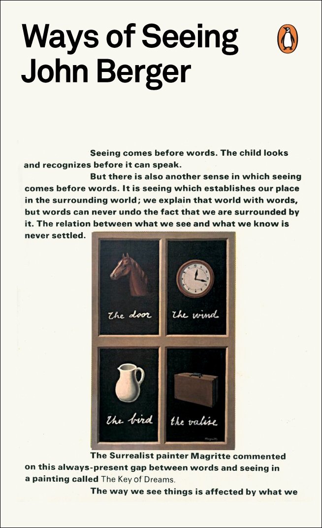
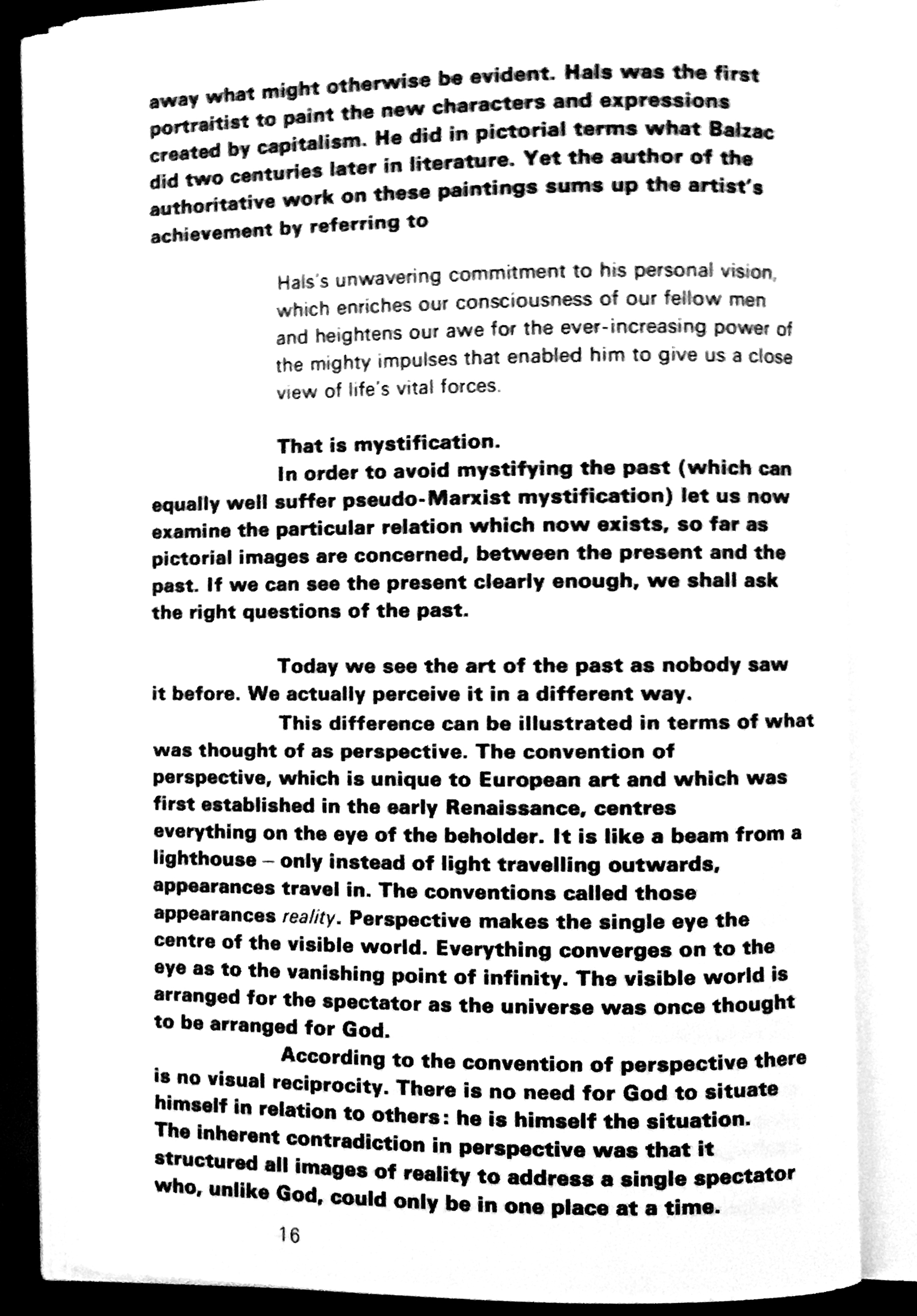
Check out John Berger’s book, “Ways of Seeing” (BBC and Pelican Books). It’s set in Helvetica Neue 85 Heavy for body text and Universe 55 for emphasis and extracts. Very unusual.
I agree…
Low contrast, I’m assuming. I’m currently reading InDesign Type: Professional Typography with Adobe InDesign, and it says:
Helvetica and Univers are not different enough to create contrast, but are different enough to create discord.
P.S. I don’t have Adobe InDesign, but I’m still reading InDesign Type: Professional Typography with Adobe InDesign just for the typography part ![]() .
.
No, there’s a great deal of contrast. The body text is set in Helvetica Black, like you see on the cover, and the contrasting type is Univers lite. Here’s one page from the book. You’ll see the effects of the boldface body text and lightface for extracts.
I like the looks of Univers in a book. I think it is odd to have a black weighted font set as the body text. Maybe it should be the opposite: The body text is Univers, and the contrasting type is Helvetica Black.