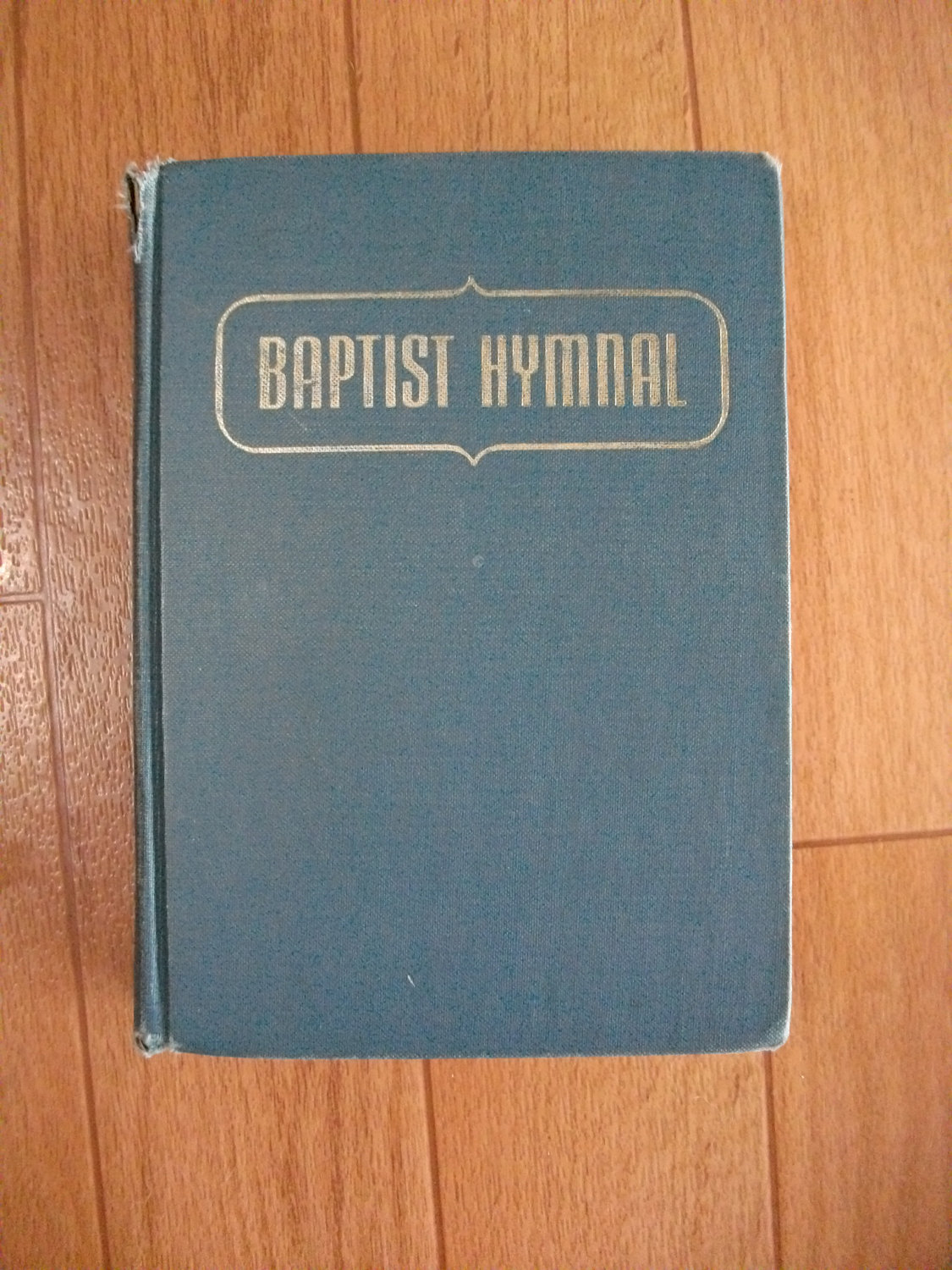
I am normally pretty good at identifying a font but this one has me stumped. It is a sans serif with parallel vertical lines from 1956 or before. The A cross line is lower than center and the H is higher. The Y divide begins about the same height as the H, it is square and then has parallel vertical lines instead of diagonal. The S center is vertical in nature. T and L vertical lines are thicker than the horizontal lines at the top and bottom. It is a narrow or condensed font. I have found some modern fonts from this decade but would like to match this font.